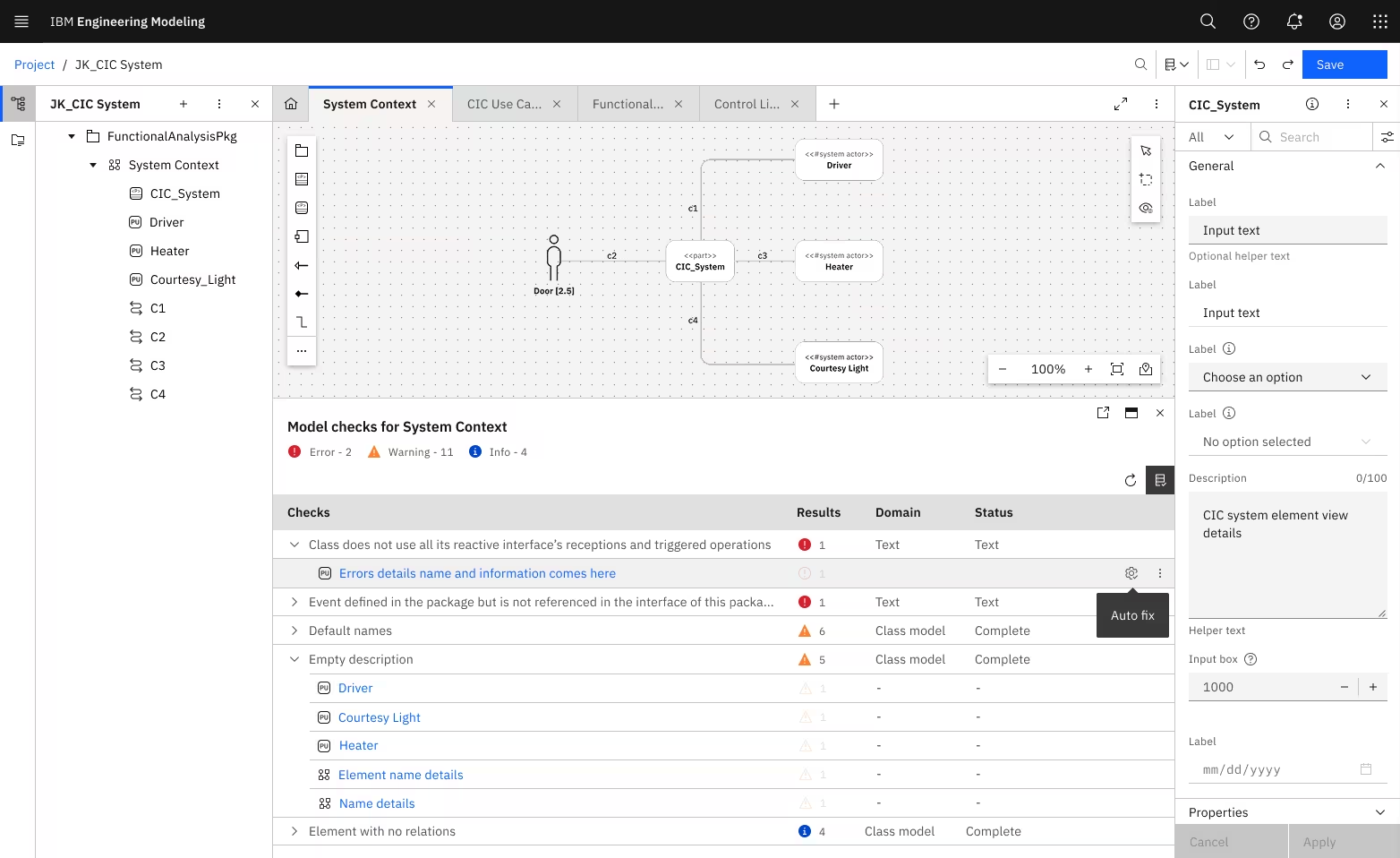
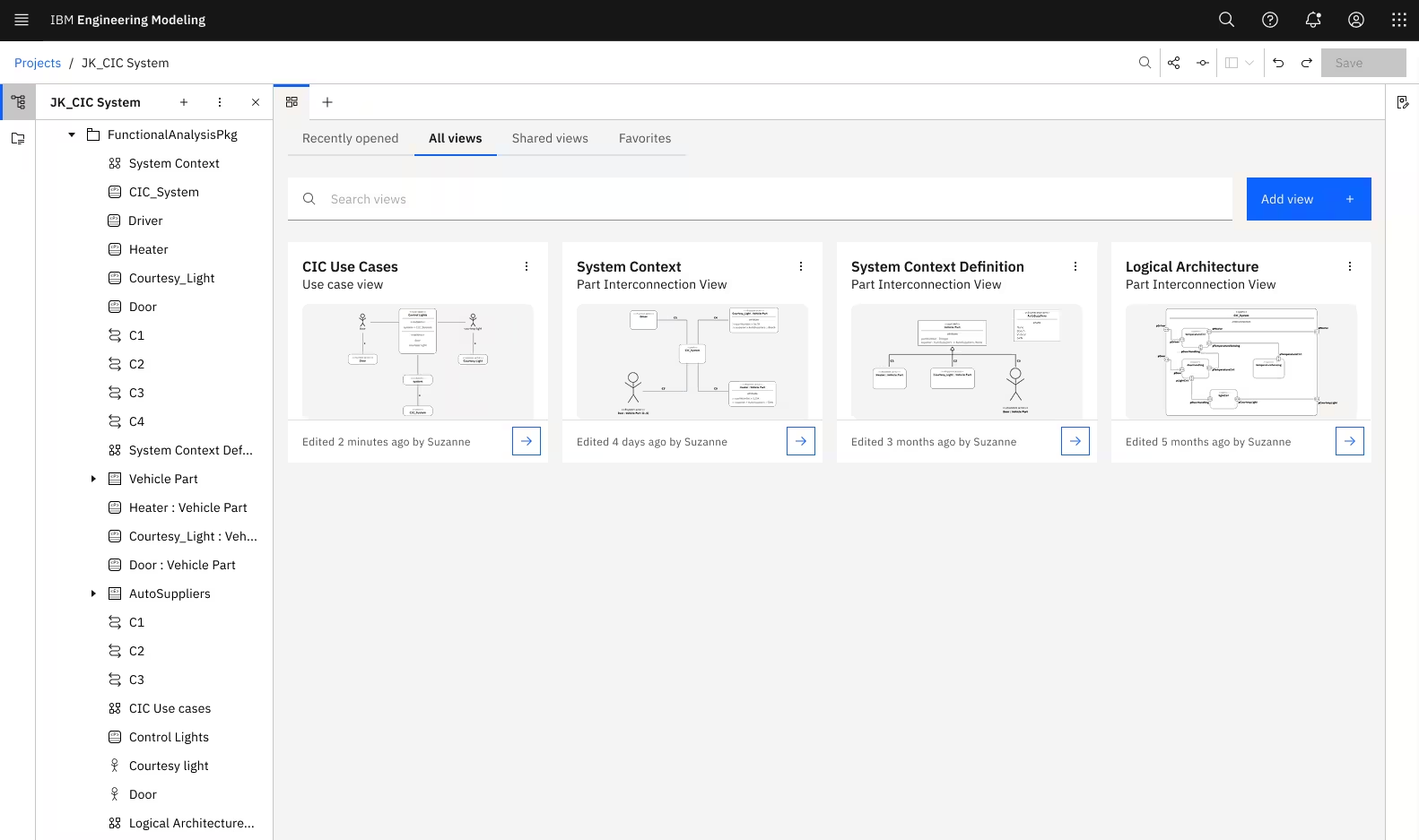
Systems engineering requires visualizing thousands of interconnected components across multiple layers. Traditional form-based tools can't handle that complexity.
We needed to build a canvas-based modeling environment from scratch.
Systems engineering is where complexity lives. Aerospace engineers designing satellites. Automotive teams coordinating software, hardware, and safety systems. Defense contractors building systems-of-systems where one failure cascades catastrophically.
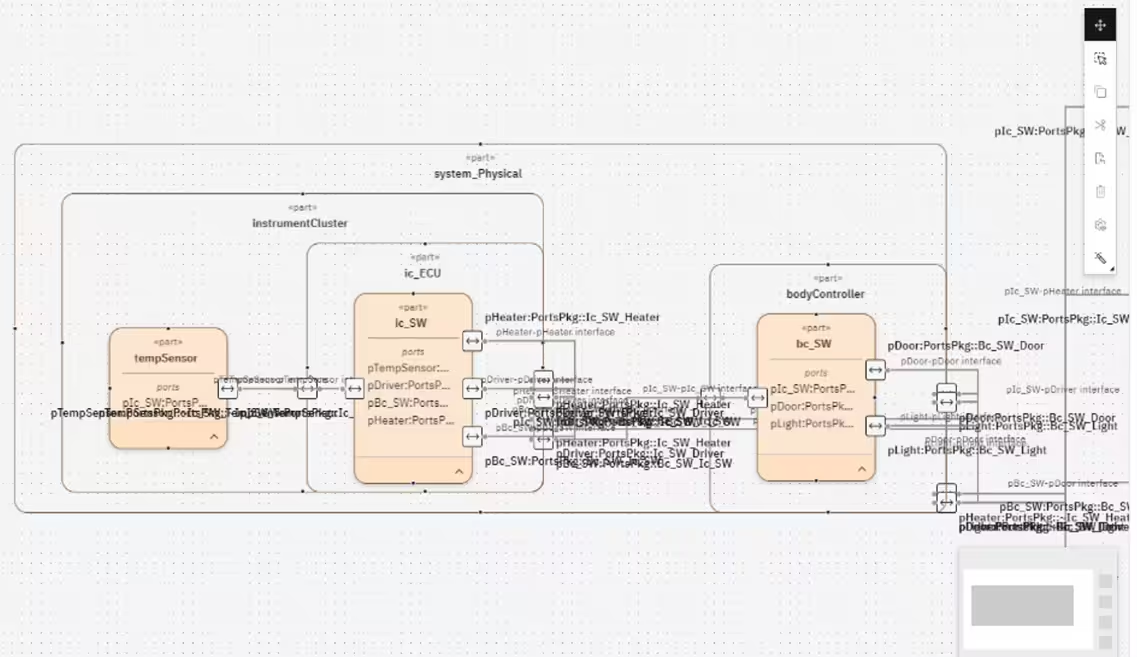
These engineers model thousands of interconnected components across multiple layers – requirements, behaviors, structures, all needing to stay synchronized. Traditional form-based tools can't visualize that complexity. They needed something fundamentally different. IBM needed a canvas-based modeling environment. And it needed to be built from scratch.
reduction in time to create complex workflow diagrams
of INCOSE demos successful. Every presentation drew strong interest
visual assets and design components were contributed to the Carbon Design System – including canvas controls, diagramming elements, and interaction patterns. These assets are now reused across IBM's product ecosystem, accelerating development for any team building canvas-based experiences
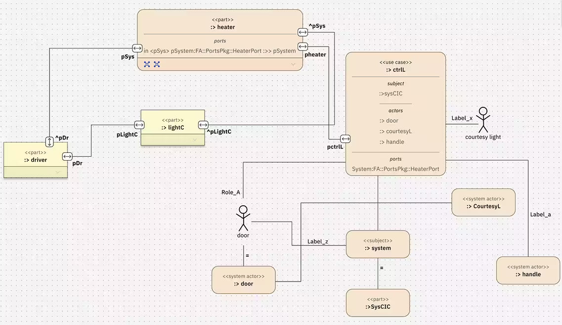
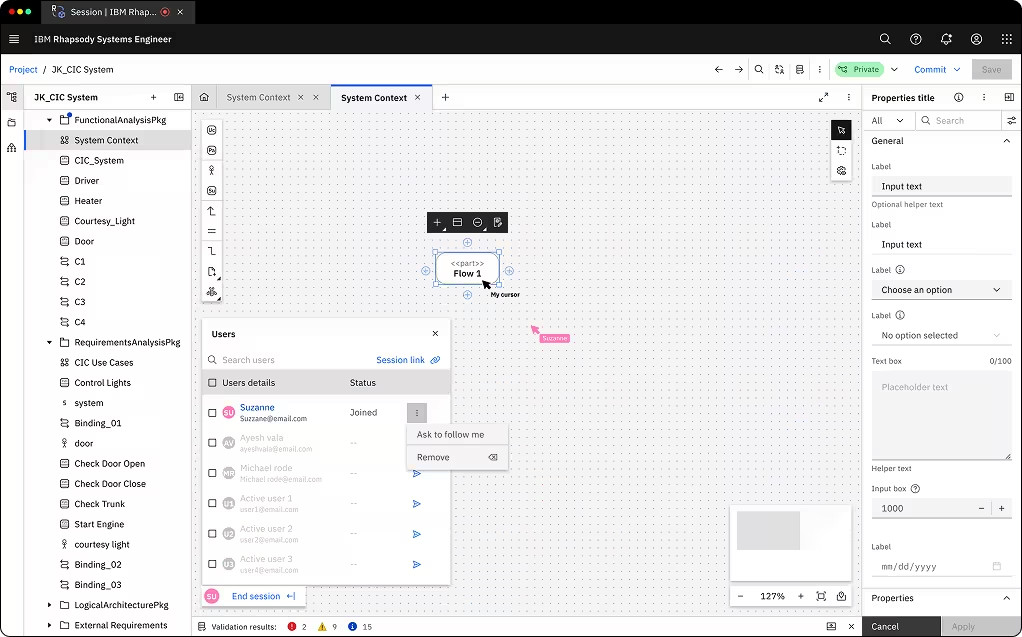
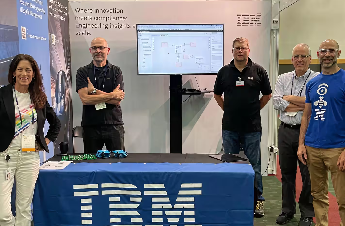
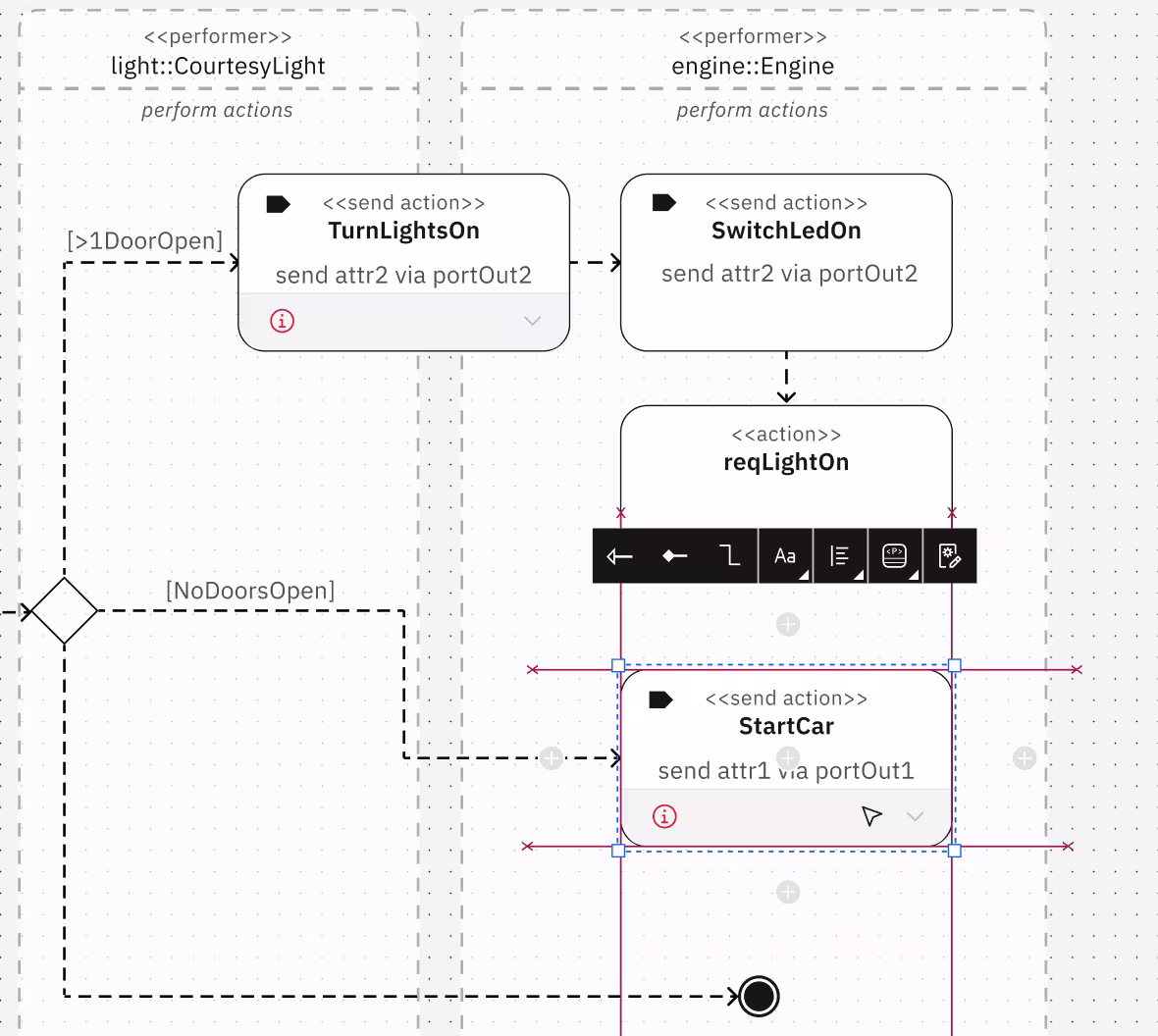
Our presentation room was packed. The demo showcased Action Flow diagrams, Harmony process visualization, and real-time collaboration features – all built on the brand-new SysML v2 standard.
Even rival systems engineering tool vendors acknowledged the quality of our user experience – a rare moment of cross-industry recognition that IBM had set a new benchmark.
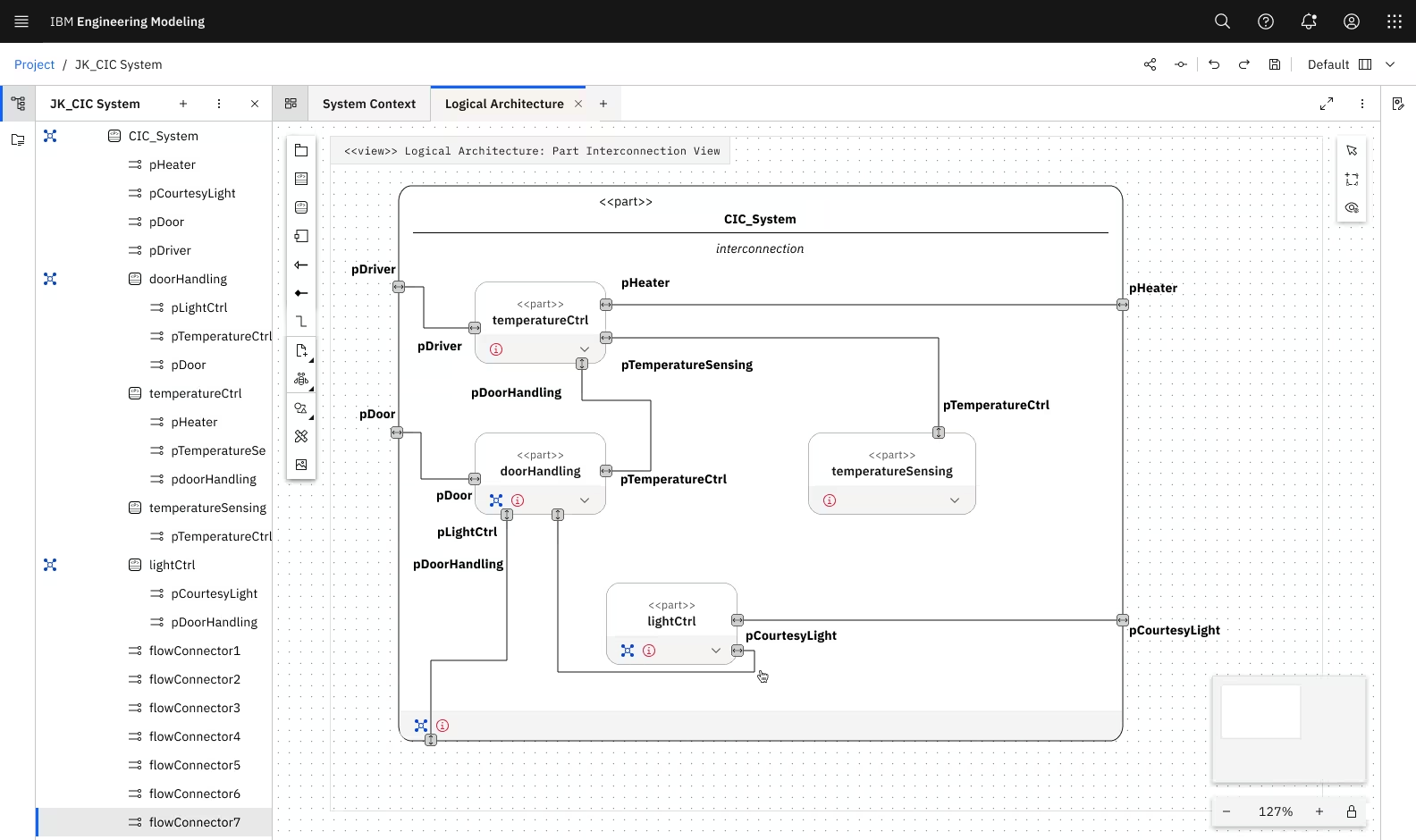
Systems engineering requires visualizing relationships that span multiple dimensions of information density, glanceability + depth, and crazy connectivity. Traditional approaches (like forms, tables, static diagrams) couldn't handle this kinda of flexibility.
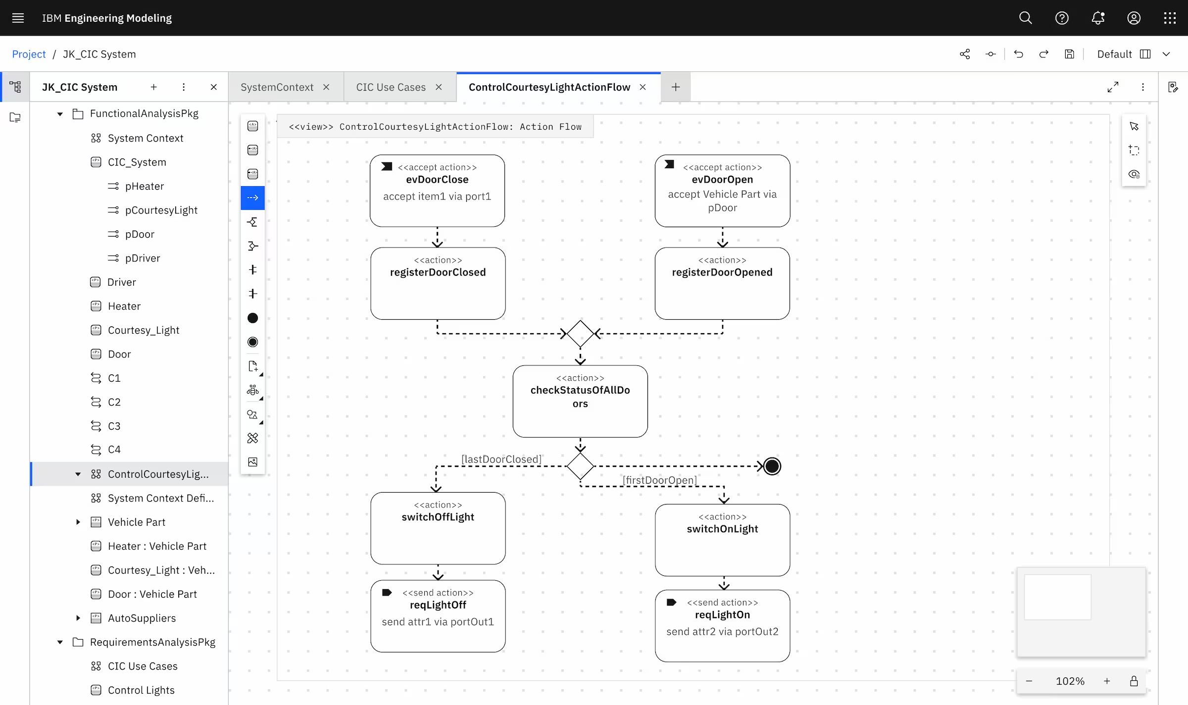
Action Flow diagrams model how systems behave – sequences, decisions, parallel processes. But SysML v2's approach was fundamentally different from previous standards. These gaps created inefficiencies and threatened our GA milestone. Additionally, the project faced organizational chaos – new team, evolving standards, tight deadline.
I acted as a mini project coordinator to drive that alignment across chaotic conditions:
Coordinated with SMEs to understand SysML v2 spec as it evolved
Prioritized features through impact-effort analysis with PM and dev teams
Facilitated 3-in-a-box discussions to ensure standards compliance + usability
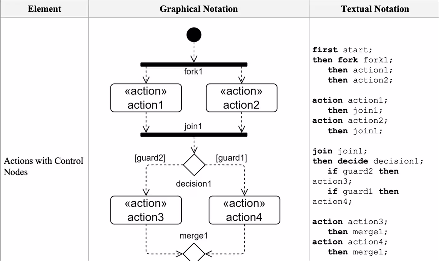
Every visual element had to match SysML v2 standards exactly – shapes, connectors, labels, decorations.
But SysML v2 specs were technical documents, not UI guidelines. I had to interpret engineering notation into pixel-perfect visual designs.
Guard conditions control which path a workflow takes based on conditions (like "if temperature > 100°C, trigger cooling system").
Our designs helped engineers to model complex decision logic without leaving the visual context.
Swim-lanes organize activities by actor, system, or phase. SysML v2 supported both vertical and horizontal swim-lanes, but interaction patterns were undefined.
How do engineers create, resize, merge, and nest swim-lanes while maintaining visual clarity?
Drag-and-drop swim-lane creation with smart snapping
Smart validation to flag swim-lane overlap errors with tooltips
Visual cues showing valid drop zones
Consistent resize handles that respect content boundaries
Action nodes needed both visual and textual representations. Engineers switch between graphical modeling and text-based specifications frequently.
Smart flow actions bring palette tools directly to the canvas, enabling quick access to frequently-used actions without leaving the workspace.
Easy switching between text and graphic view
Quick-access palette actions directly on canvas via smart flow shortcuts.
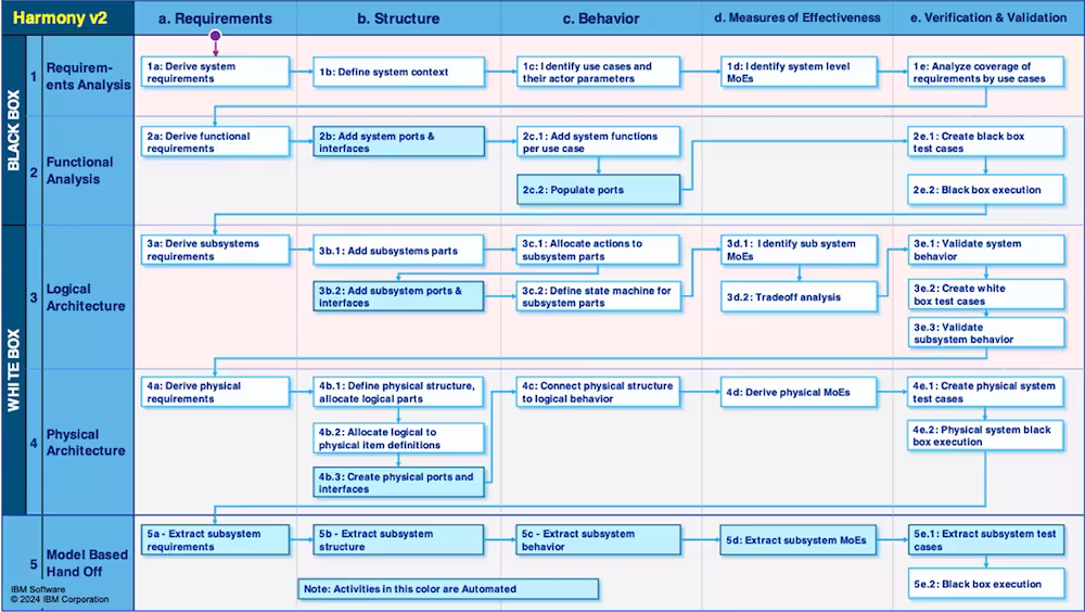
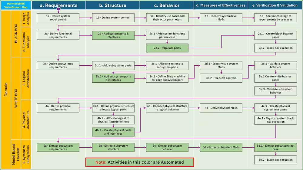
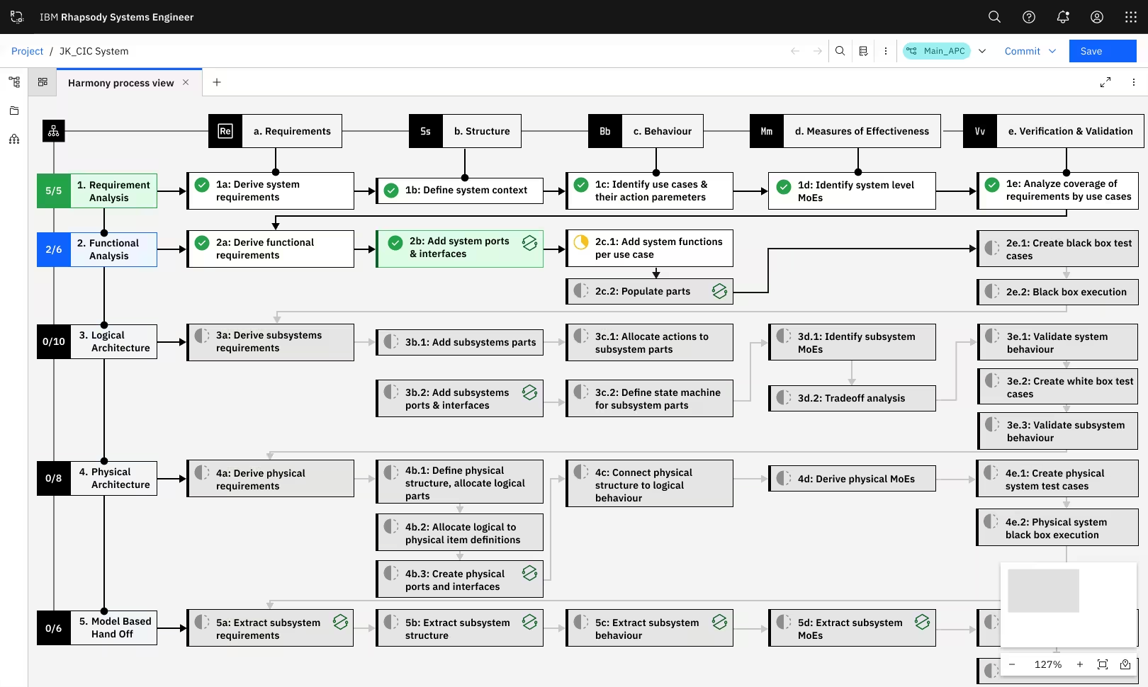
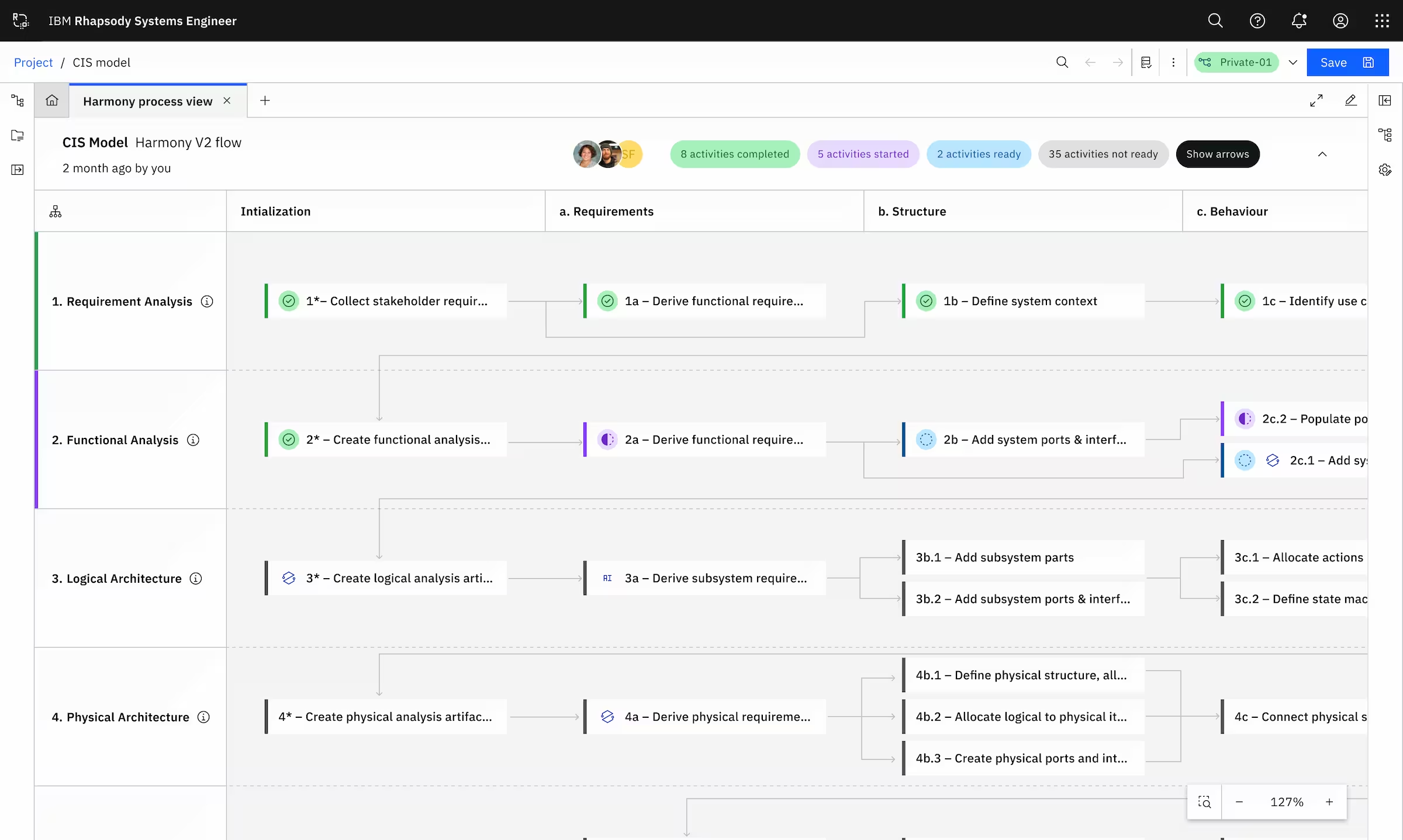
Harmony is IBM's model-based engineering framework – a methodology guiding systems engineers through complex project phases. But it existed only as backend logic and static documentation.
Engineers couldn't see where they were in the process, managers had no visibility into progress, and onboarding new team members was painful. I transformed an invisible framework into an intuitive, interactive canvas experience.
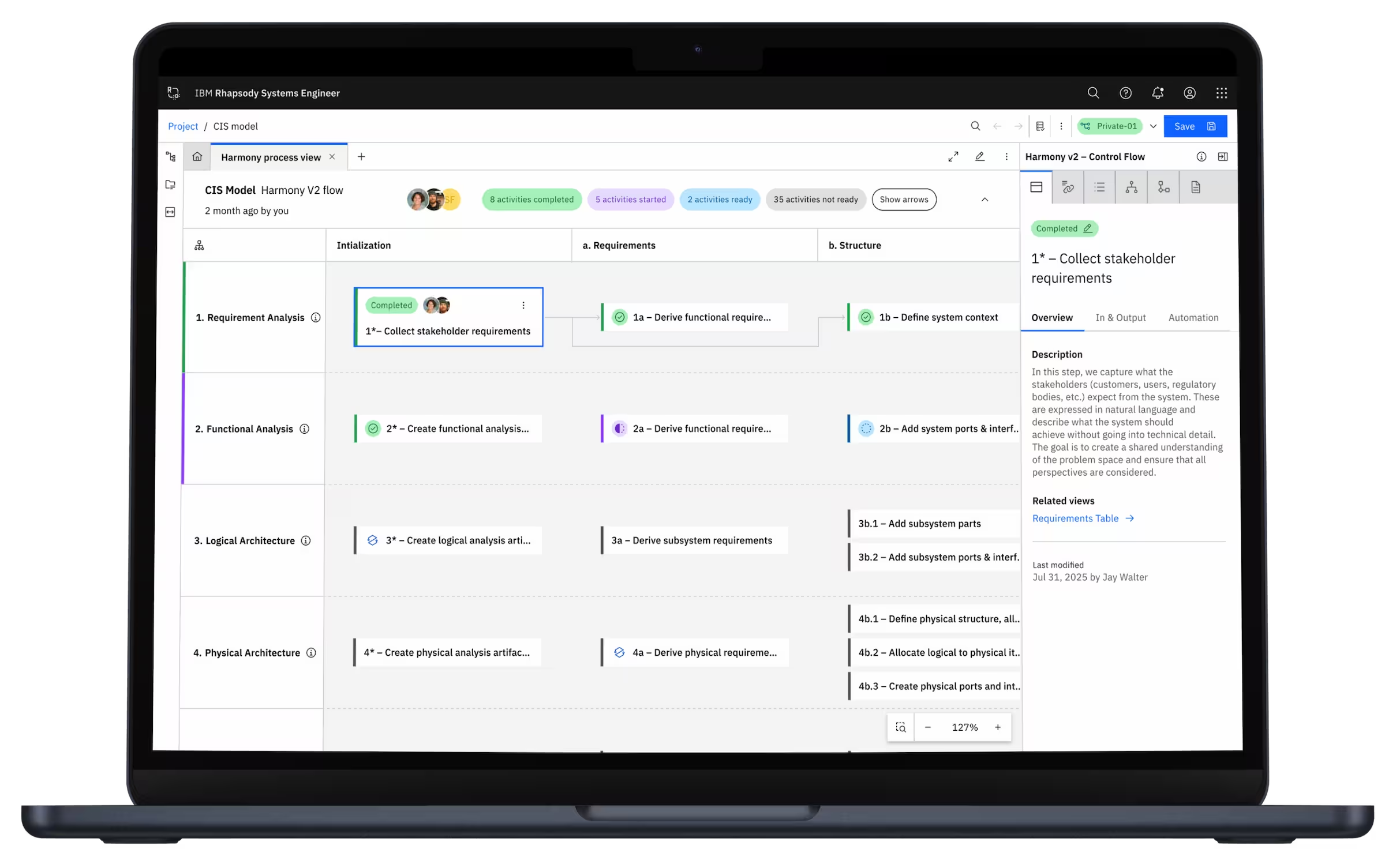
Visual representation of the entire Harmony process on canvas
Progress indicators showing which phases are complete, in-progress, or upcoming
Activity highlights with data-driven insights within specific layers
High-level overview for managers (strategic view)
Drill-down capability for engineers (tactical details)
Focus on specific workflow phases without losing context
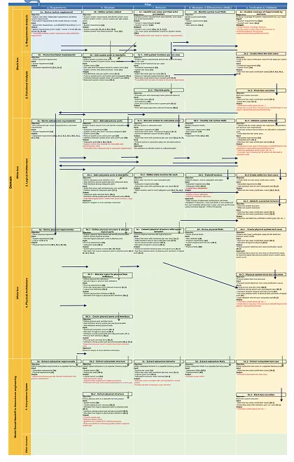
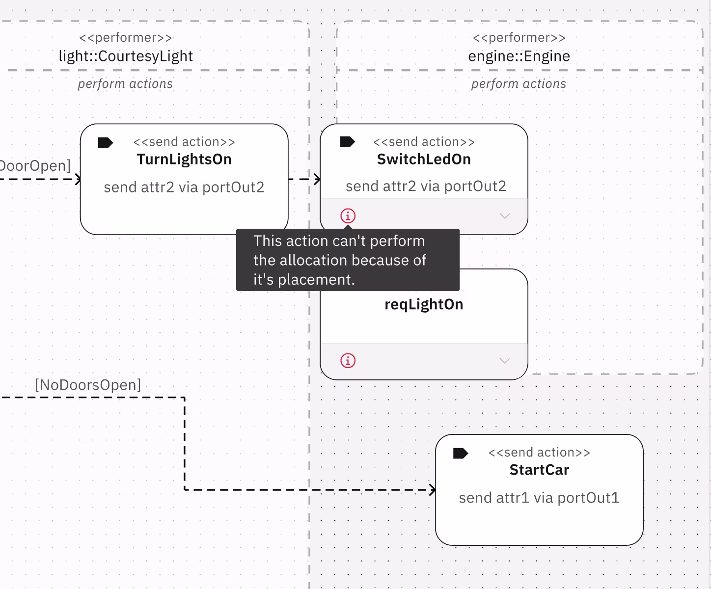
We also designed integration between Rhapsody SE and other IBM Engineering Lifecycle Management (ELM) tools via OSLC protocol. This was big!
In complex diagrams, fixed edge label positioning caused overlapping labels, reducing readability and creating visual clutter.
So we designed dynamic edge label management system allowing users to reposition labels via drag-and-drop while maintaining contextual relevance, even with layout changes.